an insurance ad campaign that kicks boring and yawn to the curb
These days, more and more brands are striding past blah and heading for bold. When Pacific Blue Cross approached me, they surprisingly wanted to make the same statement. They agreed that marketing pieces for a service that protects you and your loved ones from morbidity don’t need to make your eyes glaze over. The days of safe, corporate, “beige” (or blue) design were over. They were ready for a change.
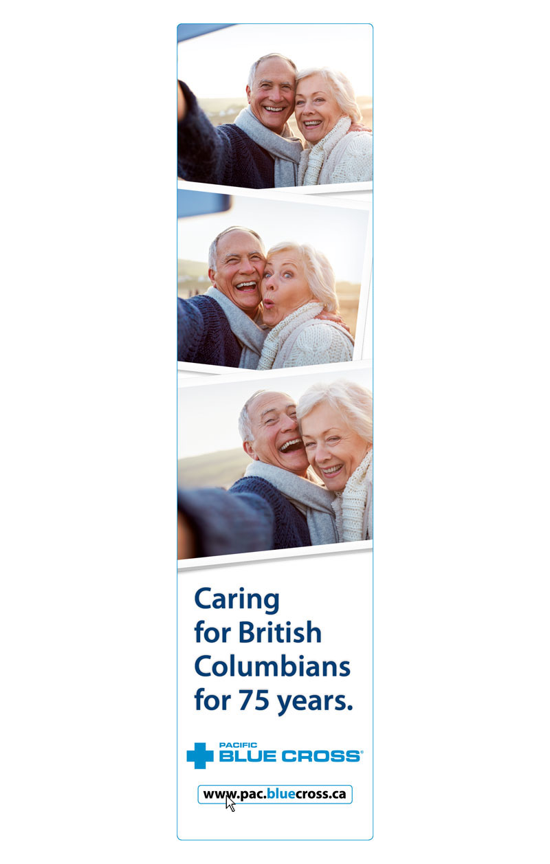
A little history on Pacific Blue Cross first. They have had the health, dental and travel benefit market cornered in BC for the past 75 years. No small achievement. Nor was taking them through the transition into a bold world of design. I could hardly wait to get started.
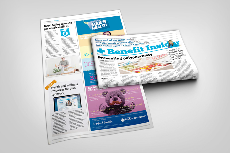
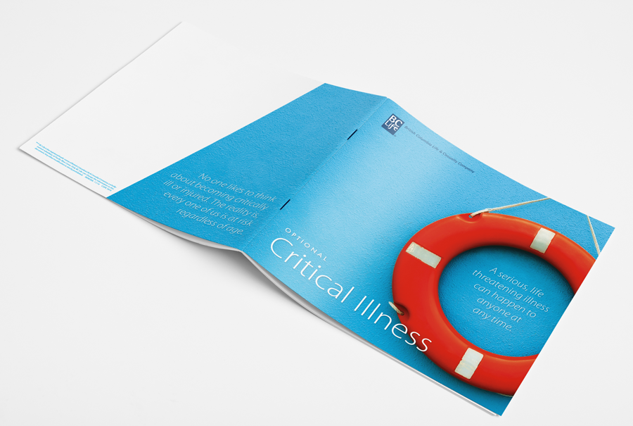
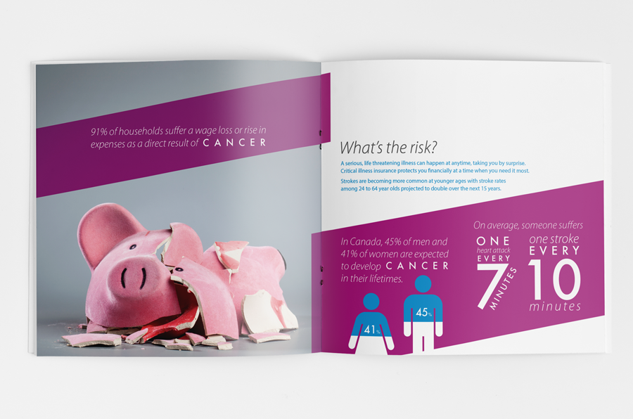
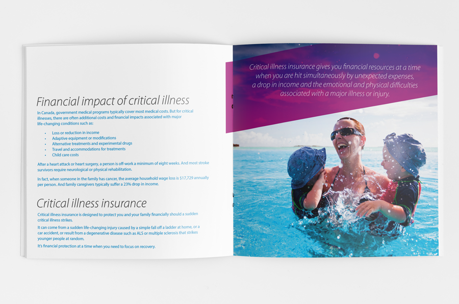
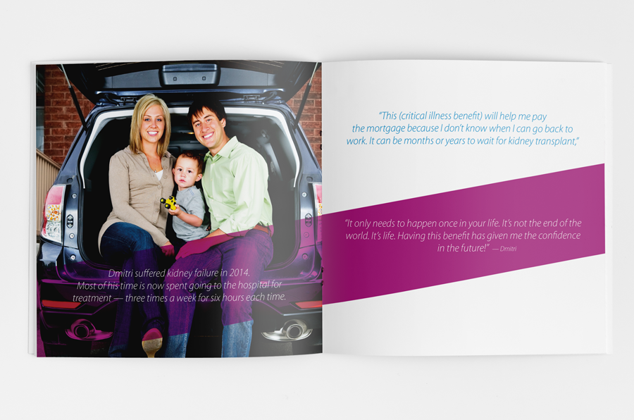
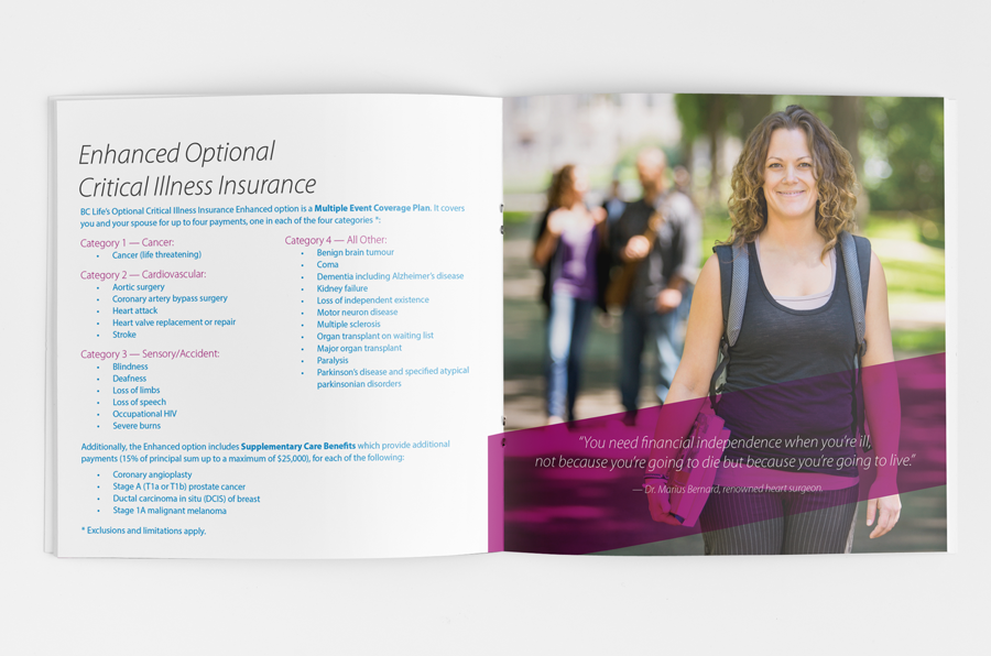
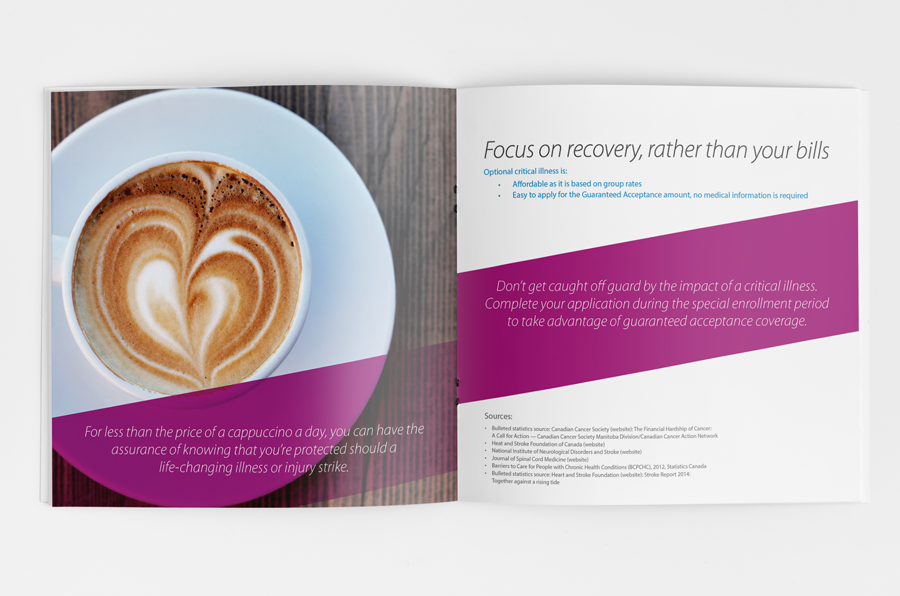
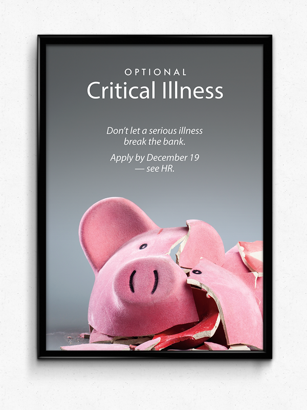
The Critical Illness campaign covers serious subject matter and typically tugs on fear to generate sales. The design objective for this campaign was to swing the pendulum in the other direction towards lifestyle based messaging that encouraged smart consumer buying decisions. While the somewhat typical imagery of piggy banks, life buoys and mugs of coffee are still used, I carefully selected stylistic photography and punched them up with striking contrasting colors complimented by clean typography.
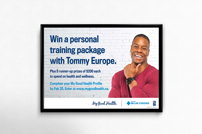
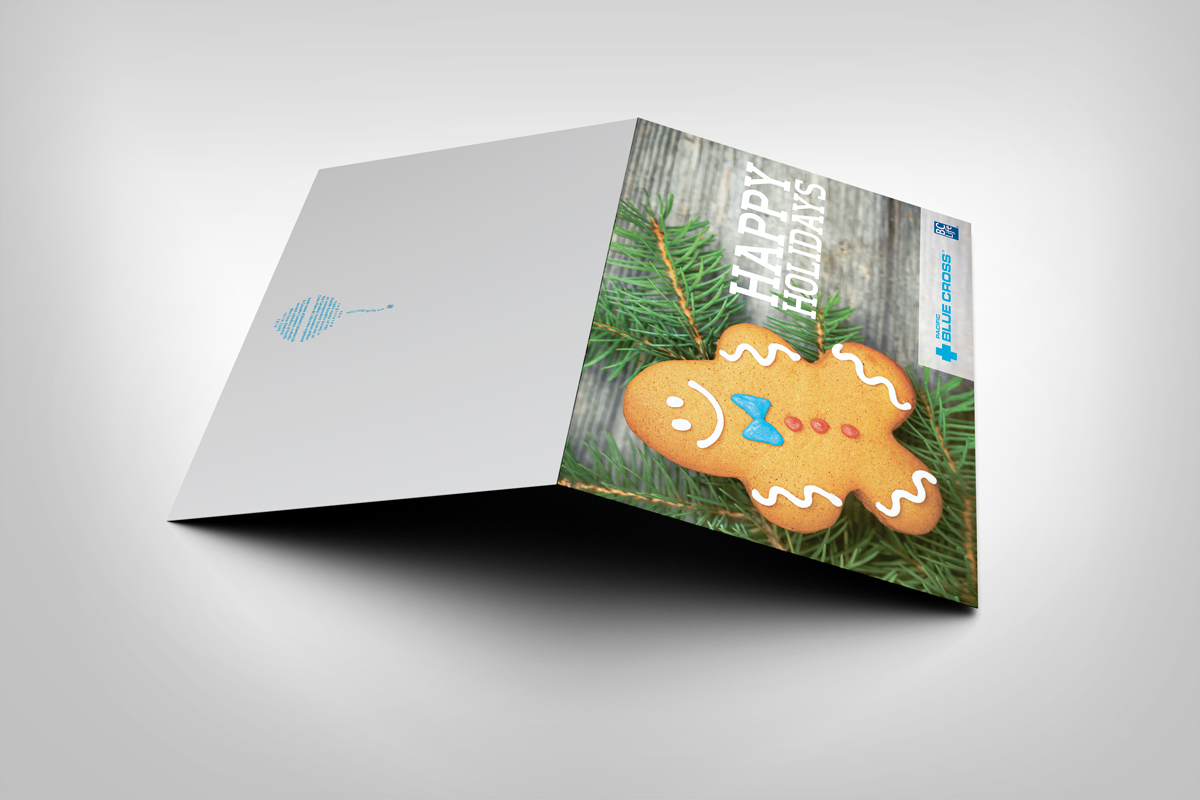
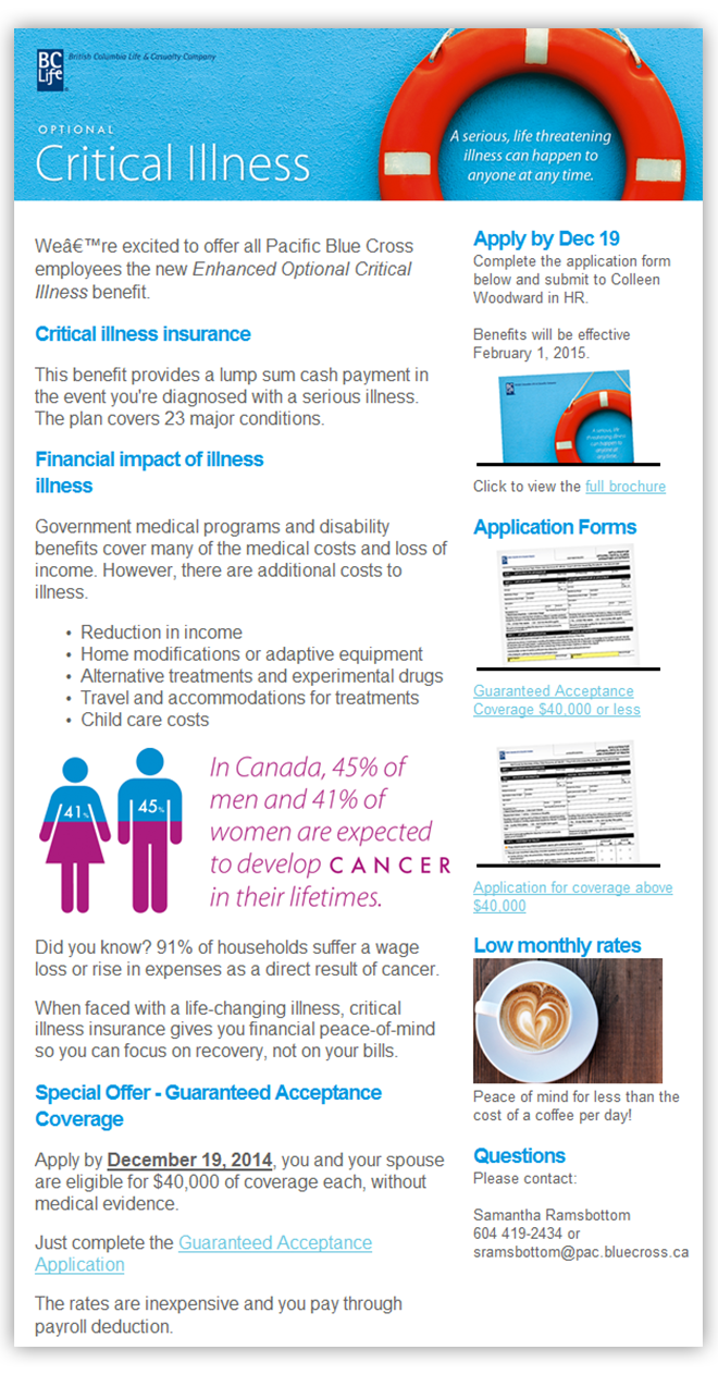
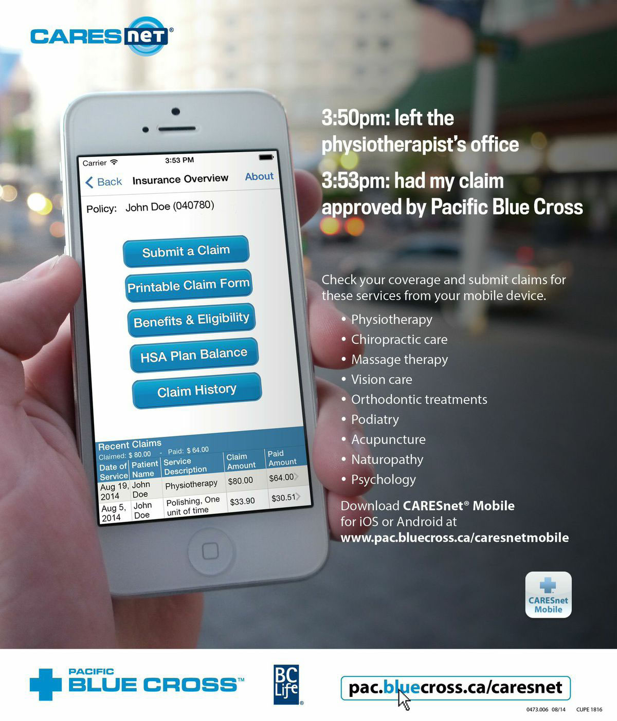
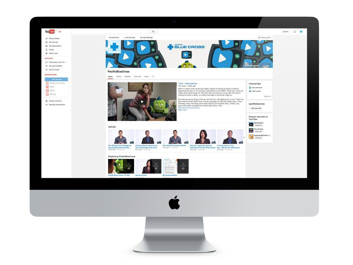
The suite of collateral included newsletters, ads, product brochures, forms and swag design. Yes, even forms. And I like to think we effectively countered the "yawn" of insurance.